Links to Articles
Publishing The Lord of the Rings
V The First Impression of RotK
VI The First Boxed Edition
VII The Readers Union Edition
VIII The First Deluxe Edition
IX Printing and Binding LotR
XIV LotR: A Bibliography
XV LotR: A Bibliography of Slipcases
The History of Middle-earth series
I A Guide to the Contents
II Prices on Dustwrappers
III Original Retail Prices
IV Print Run Sizes
V The Guild Publishing Editions
VI Shaping of Middle-earth Wrapper
VII Peoples of Middle-earth Pulped?
Other Articles
Christopher Tolkien Bibliography
I Think I've Got A Hobbit
Missing Images
Nasty Tricksy Hobbits
Printing and Binding The Hobbit
Songs for the Philologists
The Princess Hobbit
-- Ferguson Dewar
-- Letter from J. R. R. Tolkien
-- Gandalf: Not 'Magician' but 'Wizard'
-- Visions of Gollum
-- Of Smaug and the Jabberwock
-- Magazine Gallery
Tolkien Calendars
Tolkien the Esperantist?
Tolkien's Languages and Alphabets
Unpublished Manuscript Found?
Special thanks to David W. Miller and The Tolkien Bookshelf for supplying some of the images for this article. Browse The Tolkien Bookshelf at abebooks to see a range of scarce and usual Tolkien books.
 Introduction
Quality Counts
An Enchanting Picture
Pauline Baynes
The Artwork
The Devil is in the Detail
Delays and Frustrations
One Size Does Not Fit All - Part 1
One Size Does Not Fit All - Part 2
The Second Deluxe Edition
Image Gallery
References
For more detailed images and additional notes regarding the preliminary pages, slipcase and bindings see the image gallery.
Introduction
As with the First Boxed Edition and the Readers Union Edition, very little information regarding the First Deluxe Edition of The Lord of the Rings has been published. The little that is known has been reported by Wayne G. Hammond:
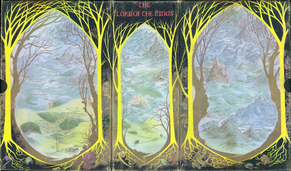
"In 1964 a deluxe set, printed in 1963, the three volumes bound in black cloth with ribbon markers, was issued in a slipcase featuring a colour illustration by Pauline Baynes, a 'triptych' view of Middle-earth."
J.R.R. Tolkien: A Descriptive Bibliography, p.98.
[A triptych (pronounced trip-tik) is a painting or carving on three panels (usually hinged together)]
The re-construction of the history of the Deluxe Edition has been hampered by the fact that, while most of the letters sent by A&U in the mid-1960s have been preserved, very few of the letters received were retained in the central correspondence files. However, the existence of letters, and the dates of events and actions, can often be deduced from comments made in letters from Allen & Unwin.
Quality Counts
As discussed previously, Allen & Unwin had experimented extensively with slipcases to try to produce a boxed edition of acceptable quality at a relatively low cost. Sales indicated that there was a demand for such a set, but experience had shown that where cost was the controlling factor, the slipcases produced were not sufficiently robust and were often damaged before they made it into the shops. This inevitably led to complaints and returns from booksellers and readers. In addition, as costs had risen with time, selling the Boxed Edition for 63s. was becoming uneconomical and A&U wished to avoid increasing prices for as long as possible.
 On 23 March 1964 Ronald Eames wrote to Jarrold & Sons, the printer and binder of The Lord of the Rings, to inform them that A&U would be discontinuing the standard Boxed Edition but wished to investigate the possibility of producing a Deluxe Edition using the existing sheets of the three volume edition. The initial specification for the new edition was:
- 500 sets bound in Tego Buckram
- Coloured endpapers
- Head and tail bands
- Gilt head
- 500 "really stout slipcases" using millboards and a printed linson cover
- A colour 'paste-on' cover for a slipcase printed on white linson – reproduced from an artist's original similar to that used for The Adventures of Tom Bombadil. (With an initial print run of 3,000 copies)
Rayner Unwin wrote to Tolkien on 15 April to ask for his approval of the decision to discontinue the Boxed Edition and to consider the introduction of a Deluxe Edition priced at £5.5s in a slipcase illustrated by Pauline Baynes.
Jarrolds appear to have supplied the estimate by mid-April because on 15 April Ronald Eames replied with some modifications to the specification:
- Gilt edges all round
- Grey endpapers, Grosvenor Chater's Glastonbury quality
- Binding boards increased to 2lbs (Thames Improved Quality)
- A grey bookmark
 He asked Jarrolds to make up a specimen slipcase covered with plain grey linson (as the illustration was not yet available) and to bind up a set of books in a deep red buckram.
This Deluxe Edition was aimed at the Christmas and birthday markets and was to be sold at an "enhanced price". To justify the increased retail price, superior quality materials had to be used. Buckram is a hard wearing fabric (usually made from cotton or linen and stiffened with size or glue) and was a great improvement on the relatively cheap, easily stained red cloth used for the standard edition. The boards on the standard trade edition are just 2mm thick, whereas the 2lb Thames Improved Quality boards are 4mm thick - a considerable increase that, combined with the use of the buckram, produces a much more solid feeling book. The head and tailbands, heavier weight coloured endpapers, silk bookmark and gilt page edges were relatively inexpensive, but all added to the overall 'feel' of quality. However, the key element was the slipcase - if this was not of sufficient quality the whole project was flawed. Ronald Eames was all too aware of the problems with the slipcase for the earlier Boxed Edition and knew that the use of millboards and linson as materials was a prerequisite for a high quality product.
Jarrolds had not produced the specimen set by 19 May, so Mr. Eames chased them up, informing them that the artist would need at least a month to produce the full-colour cover artwork and the set was required for the Christmas market. This meant that in order for A&U to maximise sales they needed to have completed sets available for distribution in September, or October at the latest.
An Enchanting Picture
Tolkien replied to Rayner Unwin on 28 May apologising for the delay in replying. He agreed to the discontinuation of the boxed edition and the introduction of a new Deluxe Edition, suggesting that a scenic design would be best - perhaps with the eruption of Mount Doom as the central motif.
The specimen set seems to have been available by 12 June when Rayner wrote to Pauline Baynes to ask her to produce the artwork for the slipcase. The illustration needed to cover the sides and back of the slipcase (so the design could be either in the form of three panels or a wraparound illustration) and also needed to incorporate the words "The Lord of the Rings" somewhere on the back panel. Rayner made it clear that the subject matter was entirely her decision, but passed on Tolkien's suggestion of an erupting Mount Doom. He added that he hoped that Pauline would be able to fit the work into her schedule, because he was anxious for the set to be available before Christmas - however he also admitted that she was the only artist suitable for the job as she was the only person "whose eye is wholly in tune with Professor Tolkien's imagination".
Pauline entered into Tolkien publishing history in 1948. Tolkien was immediately attracted to the pen-and-watercolour cartoons in a medieval style in her portfolio and selected her to illustrate Farmer Giles of Ham (1949). This was followed by a drawing for an advertisement for The Return of the King (1955, right), cover artwork for the Puffin Edition of The Hobbit (1961), and illustrations for The Adventures of Tom Bombadil (1962). After completing the artwork for the Deluxe Edition of The Lord of the Rings (1964) she went on to work on several more Tolkien titles:
The advertisement opposite appeared in The Listener on 27 October 1955. The artwork was designed to illustrate the description on pages 231-2 of The Return of the King: |

Pauline Baynes replied saying that she would be delighted to accept the commission to produce the artwork; even though she was very busy working on illustrations for six educational books that had to be completed before December. She confessed to feeling nervous about the project, especially the need to "tune into the right Tolkien wavelength". The specimen boxed set was with Pauline a few days later with a request from Rayner that the job be completed by the end of July or early August if at all possible. She had not read The Lord of the Rings and was not familiar with the characters or landmarks, but her sister Angela Baynes had read and enjoyed the books. Angela produced a painting that included the main characters and scenes, and Pauline used this as a starting point and guide for her work.
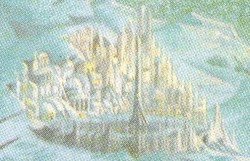
On 30 July Pauline Baynes sent in the completed artwork for the slipcase with much trepidation - in her accompanying letter she was rather self-deprecating, saying that she was trying to give an impression of the book but had fallen short because the subject was so vast; she also wondered whether her lettering would be too amateurish to be acceptable. [There is no evidence that the lettering was altered in any way] Her letter went on to apologise for using a little artistic license - it was impossible to match the map accurately and to include some of the landmarks at the same time.
Rayner Unwin and all at A&U were entranced - the results had exceeded all their expectations. The following day Rayner visited Professor Tolkien and showed him the artwork. According to Rayner "he was enchanted" and said that Pauline "had exactly his eye for landscape". Tolkien asked if, once the technical work had been completed, he could have the original on permanent loan for his study.
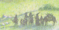
The Fellowship of the Ring The Two Towers The Return of the King According to Pauline Baynes, the figures that surround the scenes should not be taken to be anything specific: "The little figures round the edge are really supposed to fill in his [Tolkien's] remark of 'and other things worse than those' when speaking of the unsavoury characters to be encountered in the wild lands. No one need necessarily be anything, if you know what I mean?" The phrase 'and other things worse than those' does not actually occur in any of Tolkien's published works, but there are several passages in The Hobbit and The Lord of the Rings that fit the bill. Perhaps the most likely one being:
In a later note Pauline wondered if it would be better to black out the figures around the panels. A reconstruction of the complete illustration can be seen here. |

The Devil is in the Detail
On 4 August, with the matter of the artwork now settled, Ronald Eames sent orders to Jarrold & Sons for the manufacture of the slipcases and the binding of the books in the deluxe style. Some additional changes to the specification for the slipcase were requested:
|


- Increase the thickness of the sides and back of the slipcase to match the top and bottom panels
- Make the slipcase fit the books more tightly than the specimen
- Bevel the thumb slots
The specification for the binding of the three volumes was also amended:
- Binding material to be Winterbottom's Buckram 72 - which is black
- Backs of the books to be more rounded
- Fore-edges to be more concave - they were straight on the specimens
- Outer edges of the boards to be neatly bevelled
The binding and slipcase making orders were to be completed "in about a month's time", subject to the approval of a further specimen set to the updated specifications. Mr. Eames also restated A&U's desire to give this new edition an appearance of real quality.
The following day the slipcase artwork was despatched to the printers. It was to be printed by four colour lithography, with the remaining parts of the slipcase to be printed in black, i.e. the top, bottom and inside of the slipcase. While 5,500 copies would be required eventually, in the first instance sixty trimmed proofs on Mellowtex (or a similar litho paper) were required by the end of August.
Allen & Unwin and Jarrolds now started to work out exactly how the slipcase would be constructed. Ronald Eames suggested two ways that the slipcase could be put together:
- Cover the entire slipcase in linson; the top, bottom and inside parts of which would be printed black (or black linson used). The artwork would be printed separately on cartridge paper (Mellowtex) and then pasted around the sides and back of the slipcase on top of the linson.
- Print the design straight onto plain linson, which would have sufficient surround for the over-printing of the black top, bottom and insides referred to above. This would eliminate the need for the separate paste-on of the artwork, but it would be essential to have plain linson and not a linen embossed variety.
Mr. Eames noted that Option 2 would probably be cheaper, and thought it would be best to proceed along those lines as long as Jarrolds could confirm that the result would be satisfactory. Jarrolds seem to have been uncertain whether good results could be achieved when printing on linson, so proofs of the artwork were called for on both linson and cartridge paper, together with specimen slipcases in both styles.
When the work in progress sheet landed on Ronald Eames's desk on 1 September he was alarmed to see that the new Deluxe Edition was listed as 'to be scheduled'. Jarrolds explained that this was down to the manufacture of the slipcases. Mr. Eames suggested that if they did not have the resources to handle the project they should contact Runprint Ltd of Paulton (near Bristol), a member of the Purnell Group - they had supplied slipcases to A&U earlier in the year for a boxed edition of The World of Mathematics by James R. Newman.
On 14 September Jarrolds were instructed to send a specimen set of the three volumes to Runprint to use as a template for a specimen slipcase. Ronald Eames informed Runprint that, because the Deluxe Edition was due out in time for Christmas, the completed sets were required by the end of October. [Eight weeks than originally planned] Runprint agreed to supply the slipcases by the end of October, but Jarrolds then gave a completion date of 30 December! Mr. Eames expressed his disappointment at the date and asked for an improvement - at least a supply by the beginning of December. He wondered if the delay was due to binding - A&U could make alternative arrangements for this if required [presumably at Key & Whiting].
The proof of the paste-on artwork on cartridge paper was approved on 22 September - Mr. Eames felt that the definition was better on the cartridge than on the linson. He expressed some concerns over the colours on the proofs as compared to the original artwork, and asked for confirmation that improvements could be made. Subject to improvements (and instructions from Runprint) he gave the go ahead for the printing of 5,000 copies and the delivery of 1,000 copies to Runprint. Copies of both proofs were also sent to Runprint for their comments, along with instructions to use one on the specimen slipcase they were preparing.
Specimen slipcases arrived at Allen & Unwin's offices on 28 September but were not up to the standard of the original specimen supplied by Jarrolds, and the improvements requested by Ronald Eames on 4 August had not been incorporated. Mr. Eames asked for another specimen incorporating the requested improvements, as well as a price for the slipcases - without the costs A&U could not set a retail price and send details out to customers.
Delays and Frustrations
Further discussion of the slipcase ensued. Ronald Eames reiterated that above all else he wanted to obtain strength and quality, even if this increased costs slightly - "we do not wish to spoil the ship for a ha' pence of tar!" The main points to come out of the discussions were:
- The artwork was to be printed on a single piece of linson that was large enough to cover the outside of the slipcase. The remaining parts of the linson were to be over-printed in black.
- The inside of the slipcase was to be covered in black linson to add strength.
- The slipcase could be made from separate pieces of board as long as this did not affect the strength of the slipcase. [Problems had been encountered with the old slipcase design due to the joins at the edges that this type of slipcase construction produced]
- Printing of the artwork on linson was approved.
- Approval of the construction of the slipcase was deferred until Runprint produced another specimen.
On 16 October and again on 22 October Ronald Eames expressed the urgency of the situation: In addition to the specimen slipcase, the complete costings for the Deluxe Edition were required - they had to include the cost of:
- The slipcases
- The printing of the paste-on for the outside of the slipcases
- The binding of the books
- The insertion of the books into the slipcases
A frustrated Mr. Eames chased Jarrolds and Runprint yet again on 3 November. He asked:
- Whether the binding order had been completed
- Whether the artwork had been printed and delivered to Runprint
- When the specimen slipcase would be delivered
- Whether the order would be completed by mid-November
- What were the final costings
An advance set of books bound in the deluxe style seems to have been delivered later that day. They were approved, with the proviso that grey silk bookmark (attached at the head) were to be added.
Two days later on 5 November the specimen slipcase was finally delivered. The artwork had been printed on cartridge paper rather than the linson that had been agreed upon in September, so this new specimen was actually constructed along the lines of Ronald Eames original suggestion. In general the slipcase was strong enough and a good fit for the books, but the overlaps at the joins were a little too visible and untidy, and the thumb slots were still not bevelled. Mr. Eames asked again for the final costings and for a completion date - he wanted a delivery by mid-November. [Ten weeks later than originally planned]
By mid-November Mr. Eames had finally agreed to drop his request for the bevelled thumb slots in the interest of getting a quick delivery of slipcases, but was adamant that he required the black linson lining as well as linson on the top and bottom of the slipcase. He was still chasing the final costings and a delivery date - at least a supply of completed sets was needed by the end of the month.
Another slipcase seems to have been delivered by 27 November when Ronald Eames reported that the slipcases needed to be "a fraction larger" because the specimen supplied made too tight a fit. He sent another set of books for Runprint to use as a guide and asked them to get a supply of slipcases to Jarrolds early the following week. [Twelve weeks later than planned]
A&U finally received the complete costs for the Deluxe Edition from Jarrolds on 1 December. They were evidently higher than expected because Jarrolds were asked to check their figures - although A&U added to the original specification that Jarrolds quoted for, they did not need all of options that were included in the quotation, e.g. dustwrappers.
Precisely when the first sets were ready is unclear, but they went on sale sometime in December at a price of £6.6s - exactly twice the cost of the First Boxed Edition and one guinea (£1.1s) more than originally planned.
One Size Does Not Fit All - Part 1
Two days before Christmas Mr. Eames reported to Runprint that the slipcases were not satisfactory - the width had not been increased from that of the last specimen, meaning that the fit was overly tight and the sides of the slipcase bulged out when books were inserted. He asked that the width be increased, perhaps by an eighth of an inch, but not by so much as to cause too loose a fit.
On New Years Day 1965, Ronald Eames reported to Jarrolds that complaints had been received regarding the tight fit of the slipcase. He asked Jarrolds for 25 replacement slipcases, but none were available - presumably the 500 slipcases delivered to them had all been filled with books.
Runprint pointed out that the books could be removed without difficulty if they were not pushed all of the way into the slipcase. Mr. Eames accepted this was so, but added that the tendency would always be for people to slide the books all the way in. He asked if it would be possible to have a lip on the top and bottom edges of the slipcases - this would help prevent the books being pushed all the way into the slipcase. If this was feasible he wanted like see a specimen and to know how it would affect the cost.
The following week Ronald Eames reported to Runprint that five more slipcases have been received that were an even tighter fit than the specimen delivered in November. The side panels were bowing inwards. He wondered if, as the paste was drying out and contracting, the linson was shrinking, causing the slipcases to become even tighter. Runprint and Jarrolds were asked to check their stock for any slipcases with a similar fault and to try to ease the sides out before the books were inserted.
On 19 January Runprint supplied a further specimen slipcase. Unfortunately this new slipcase was both too wide and too tall, meaning that the fit was now too loose! Discussions about the slipcase continued for several weeks. The main points being:
- The protruding lips suggested by Ronald Eames were not a feasible proposition.
- Mr. Eames repeated his theory regarding the shrinkage of the linson.
- There appeared to be some variation in the first batch of slipcases - some were a perfect fit while others were completely unusable.
- Runprint suggested that part of the problem may be due to variations in the bulk of different sets of the three volumes.
- Jarrolds insisted that there could be no variation in the bulk of the books enough to effect the fit within the slipcase.
- Mr. Eames suggested making the slipcase narrower at the back and slightly wider at the front to enable a snug fit of both the shoulder of the books and the narrower sides.
- Runprint made a proposal for a new design for the slipcase. What this idea entailed is not clear.
The outcome of these discussions was that in February Mr. Eames asked for two more specimen slipcases to be produced:
- One using Runprint's new design
- One slightly wider at the front than the back
Jarrolds sent a further 1,000 sets of paste-ons and linson for the slipcase to Runprint and Mr. Eames sent another set of books to demonstrate the tightness of the slipcases.
One Size Does Not Fit All - Part 2
After a break of more than two months, Mr. Eames chased Runprint on 28 April to check on the order for the slipcases. Only 500 out of the 1,000 ordered had been delivered and the new specimens had not been produced.
The specimen slipcases were sent to A&U in early May but appear to have been lost in transit. The final 500 slipcases were delivered on 17 May, but two weeks later Jarrolds reported to Allen & Unwin that this latest batch of slipcases was largely unusable due to the tightness of the fit.
The promised new specimens finally arrived on 2 June. Ronald Eames sent them on to Jarrolds for comment. In view of the problems with the Runprint slipcases, he asked Jarrolds if they could now handle the manufacture of the slipcases themselves, or perhaps use a local case-maker. Jarrolds were happy with the latest specimen slipcases and asked when they could expect a supply - their local case-makers could not handle the order quickly.
Mr. Eames informed Runprint that their last batch of slipcases had been rejected by Jarrolds due to them being too tight for the books. Runprint responded by asking to see one of the problem slipcases and stated that this latest batch was actually made at the same time as the first batch.
 Ronald Eames approved the new slipcase design on 8 June and asked for the supply of 500 without delay to replace the previously rejected batch. They could be supplied in batches of 100 if this would help to keep a check on quality. Mr. Eames sent on one of the problem slipcases to Runprint and asked them to try to insert the set of books they held into it. Obviously annoyed, he commented that if this batch of slipcases was made at the same time as the first batch then something must have happened to them since, as the fit was very much worse than the first batch, bad as that was. Mr. Eames also repeated his theory regarding the shrinkage of the linson making the slipcases a tighter fit.
On 18 June Ronald Eames informed Jarrolds of the continuing problems with Runprint - they still said that they had no trouble inserting their set of books into the slipcases. He asked them to send further examples of the slipcases and books to Runprint to demonstrate the problem, and to have another look at the slipcases they held to see if any were in fact usable - A&U were in urgent need of additional sets.
A week later Runprint had responded, saying that they believed that the problems were due to variations in the bindings. Prompted by Jarrolds, A&U asked Runprint to return any sets of books that they held.
There is no record of any further response from Jarrolds on this matter. Over the following four months the slipcases were mentioned in correspondence between A&U and Runprint, but the manufacture of additional slipcases was deferred until Jarrolds had responded.
On 11 October Mr. Eames asked Jarrolds about progress regarding the slipcases and their reaction to Runprint's comments. [There may be an unrecorded letter from Runprint dating from around this time - perhaps suggesting ways to make the slipcases usable] He asked if they were now able to use the present slipcases and what quantity of complete sets had been produced. There is no further correspondence regarding the tightness of the slipcases, so it seems most likely that Runprint had suggested some method of easing the tight fit of the slipcases. The cause of the tight fit also remains a mystery, but the two most likely causes seem to have been either shrinkage as the slipcase dried out, or variations in the bulk of the bindings, or perhaps a combination of the two.
The Second Deluxe Edition
On 14 September 1966 A&U asked Jarrolds for an estimate for binding 500 sets of the Second Edition in the Deluxe style. This idea does not appear to have progressed any further.
Jarrolds delivered 149 sets of the Deluxe Edition on 2 December. This left just 37 sets in stock. Two weeks later A&U asked for the sets to be delivered to their warehouse at Hemel Hempstead. The slipcases for some of them appear to have been damaged or too tight because on 29 December A&U asked for an estimate from Runprint for a further 50 slipcases. Runprint asked if the quantity could be increased because the estimate for just 50 slipcases would be "extremely high", but Mr. Eames informed them that the quantity of slipcases ordered matched the number of sets remaining. Any subsequent boxed edition would have different dimensions due to the publication of the Second Edition. A&U would look at the estimate and then decide if it was economical to proceed. It seems that the estimate was acceptable because on 19 January 1967 they asked Jarrolds for 50 sets of the black linson used for the Deluxe Edition slipcase.
Supplies were exhausted before the end of 1967 - so ended the First Deluxe Edition of The Lord of the Rings.
Allen & Unwin seems to have steered clear of boxed editions of the three volume edition for some years afterwards, perhaps in part due to the problems experienced with the standard and deluxe boxed editions. Although they produced a batch in 1978, following the renewed interest in Tolkien after the publication of The Silmarillion, it wasn't until 1987 that the three volume boxed edition became a standard feature of their Tolkien list.
 A new deluxe edition was issued in 1969 at a price of £6.6s. The India Paper Edition was a single volume printed on India paper, using the text of the First One Volume Paperback Edition (expanded to include the Appendices), and bound in black buckram, decorated with a motif based on one of Tolkien's designs for the dustwrapper of The Return of the King.
References
J.R.R. Tolkien: A Descriptive Bibliography
Wayne G. Hammond with the assistance of Douglas A. Anderson. 1993.
St. Paul's Bibliographies, Winchester. ISBN 1873040113.
Oak Knoll Books, New Castle, Delaware. ISBN 0938768425.
The J.R.R. Tolkien Companion & Guide: Chronology
Christina Scull and Wayne Hammond. 2006.
HarperCollins, London. ISBN 0261103814 / 9780261103818.
See especially the entries for 13 April 1964, 28 May 1964, 31 July 1964 and 30 November 1964.
The Hobbit
J.R.R. Tolkien. Third Edition. 1966.
George Allen and Unwin, London.
The Return of the King
J.R.R. Tolkien. Second Edition. 1966.
George Allen and Unwin, London.
Glossary of the Book
Geoffrey Ashall Glaister. 1960.
George Allen and Unwin, London.
Allen & Unwin Archive
RUL MS 3282 - AUC 1013/5 (Letters file BAS-BD 1964)
RUL MS 3282 - AUC 1028/14 (Letters to/from Jarrold & Sons 1964)
RUL MS 3282 - AUC 1042/15 (Letters file RU-RZ 1964)
RUL MS 3282 - AUC 1071/13 (Letters to/from Jarrold & Sons 1965)
RUL MS 3282 - AUC 1086/9 (Letters file RU-RZ 1965)
RUL MS 3282 - AUC 1116/16 (Letters to/from Jarrold & Sons 1966)
RUL MS 3282 - AUC 1131/17 (Letters file RU-RZ 1966)
RUL MS 3282 - AUC 1164/17 (Letters to/from Jarrold & Sons 1967)
RUL MS 3282 - AUC 1180/6 (Letters file RU-RZ 1967)
The Woman Who Drew Narnia: Pauline Baynes by Charlotte Cory
The Artist Who Brought Tolkien's Books to Life by Evie Bowman
Pauline Baynes - Wikipedia
| If you are looking for new, secondhand or out-of-print books then AbeBooks UK may be able to help. |
|
|
| Alternatively, you can search and order through AbeBooks.com. |
|
|